
UI built for the codebase that ships it.
Production-ready high-fidelity UI in Figma — real components, every state, the edge cases nobody screenshots — paired with the engineering team that builds it. The kind of design where what you saw in the file is what ends up in the product.
Beautiful in Figma, broken in the build.
It's a familiar story: the mockups looked sharp, everyone signed off, and then the shipped product came back looking like a rough draft of it. The spacing is off, the empty states are blank pages, the buttons don't respond, and the long title overflows its card. The design didn't fail — the handoff did, because a static frame can't describe states, edge cases, or responsive behaviour, so the engineer fills the gaps with guesses. We design the gaps shut. Components, states, and tokens live in the file, and we build alongside engineering so the intent survives contact with the codebase instead of leaking out of it.
Polished in the file isn't polished in production.
Each symptom points at the same gap — between what was drawn and what got built.
- 01
The built product never matches the mockup
States, edge cases, and specs in the file — so there's nothing left to guess.
- 02
Your product looks dated
A refreshed high-fidelity system you can roll out on the existing codebase.
- 03
Handoff loses 30% of the intent
An engineering walkthrough and tokens that map straight into code.
- 04
Empty and error states are an afterthought
Every empty, loading, and error state designed, not left to chance.
- 05
Designers and engineers keep drifting apart
Pairing through the build, so the file and the code stay one thing.
UI that survives the build.
Not pretty pictures of screens — a file your engineers can ship without guessing.

Figma component file
Real components and variants, structured to be built from — not flattened mockups.
Responsive specifications
How every layout behaves across the breakpoints you actually support.
Edge & empty-state coverage
The empty, loading, and error screens your users hit — designed, not skipped.

Engineering walkthrough
A guided handoff plus tokens, so nothing gets lost on the way to code.
From a type scale to a build engineers can trust.
- 1Foundations
- 2Components
- 3States
- 4Edge cases
- 5Handoff
Each step earns the next: foundations set type, colour, and spacing; components build on them; states make each component real; edge cases catch what breaks; and handoff carries all of it into the codebase without loss.
Components, not flattened mockups.
We build the UI from a proper component library — variants, auto layout, and named tokens for type, colour, and spacing — structured the way a front-end actually gets built. That means a change to a button updates it everywhere, and an engineer can map what they see in the file to a component in code instead of rebuilding it from a screenshot.
- Components and variants, not detached frames
- Tokens for type, colour, spacing, and radius
- Auto layout that mirrors how the front end builds
- One source of truth, no drifting copies
The states nobody screenshots.
A finished product is mostly states. We draw default, hover, focus, active, disabled, and loading for every interactive element, plus the empty, error, and skeleton screens your users actually hit. The happy path is the easy part — the polish lives in the in-between, so that's where the care goes.
- Default, hover, focus, active, disabled, loading
- Empty states for every list and dashboard
- Error and validation states for every form
- Loading and skeleton states for fetched data
Paired with the team that ships it.
Engineering isn't a downstream recipient — they're in the loop while the UI is being built. We sanity-check feasibility early, structure components to match the front end, and run a proper walkthrough before the build starts. If you'd rather we build it, our engineers take the same file straight into production — the cleanest handoff there is.
- Feasibility checked with engineering early
- Responsive specs for the breakpoints you support
- An engineering walkthrough before the build
- We can build it too — file straight to code
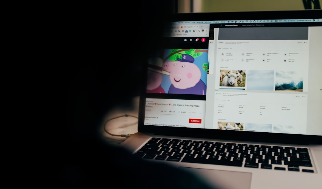

Drawn to be built, then built.
Set the foundations
Type scale, colour, spacing, and grid defined as tokens — the base everything else builds on.
Build the components
A real library with variants and auto layout, structured the way the front end is built.
Draw every state
Hover, focus, disabled, loading, empty, error — the in-between screens that make it feel finished.
Cover the edge cases
Long strings, no data, slow networks, narrow screens — the situations a static mockup ignores.
Walk it into the build
Specs, tokens, and a guided handoff — or we build it ourselves, file straight to production.
When the UI has to be right in the build, not just the file.
Polished UI is your differentiator
You're in a market where the product that looks and feels best wins — and good enough isn't.
Your product looks dated
It works, but it reads as old next to the competition, and that's costing you trust and conversions.
Handoff is lossy
Your designers draw something good and the built version comes back a rough approximation of it.
Chosen for the build, not for the portfolio.
The things teams ask first.
Make it look as good shipped.
Show us the product or the surfaces you want to lift. We'll design production-ready high-fidelity UI — components, states, edge cases, responsive specs — and pair with the team building it, so what your users see matches what you signed off. Beautiful in Figma, intact in the build.