
Pressure-test the idea before the pixels.
Low- and mid-fidelity wireframes for the screens and flows of a new product or feature — fast enough to iterate, with the fidelity tuned to whoever's looking. The cheapest place to find out whether the idea actually holds together, before anyone writes a line of code.
Everyone's arguing about a screen that doesn't exist yet.
It happens in every kickoff: someone describes the feature, and three people nod while picturing three different things. The debate goes in circles because there's nothing concrete to point at — just competing screens running in everyone's heads. A wireframe ends that. It puts one rough, shared layout on the table, fast and cheap to redraw, so the conversation moves from “what I imagine” to “this, but the step here is wrong.” You find the holes in the flow now, while fixing them costs a sketch instead of a sprint.
Talking past each other, in detail.
Each one means the same thing: there's no shared picture to work from yet.
- 01
Stakeholders argue from imagined screens
One shared wireframe to point at — so the debate is about something real.
- 02
You want to test the idea cheap
Rough layouts and flows you can react to before the build cost is sunk.
- 03
Engineering is waiting on 'the design'
Annotated wireframes that unblock the team instead of a vague description.
- 04
The flow has gaps no one's noticed
Every screen and edge path mapped, so the missing steps surface early.
- 05
Polished mockups feel too final to question
Low-fi on purpose — ugly enough that people fix the structure, not the font.
Something concrete to react to.
Not finished design — the structure of the thing, fast enough to keep changing.

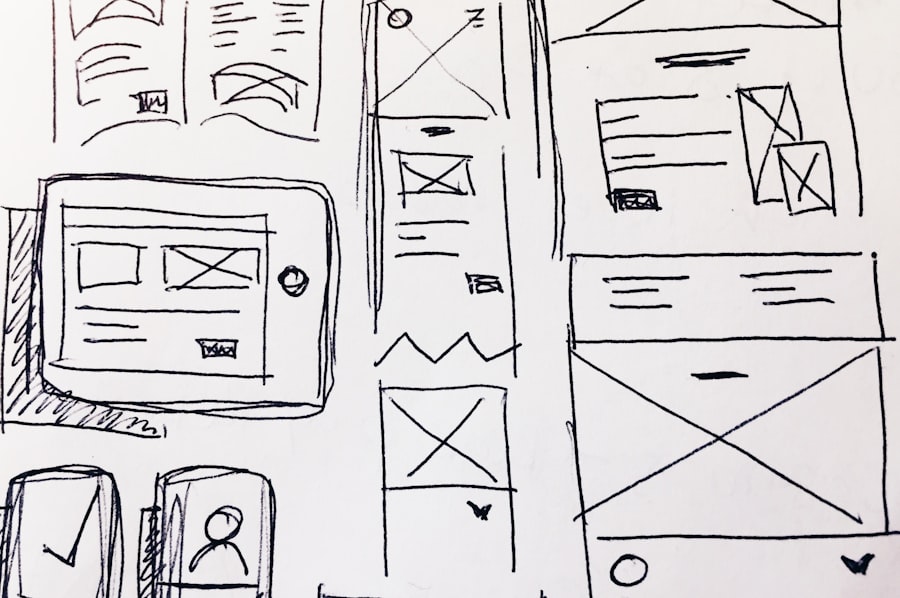
Low-fidelity wireframes
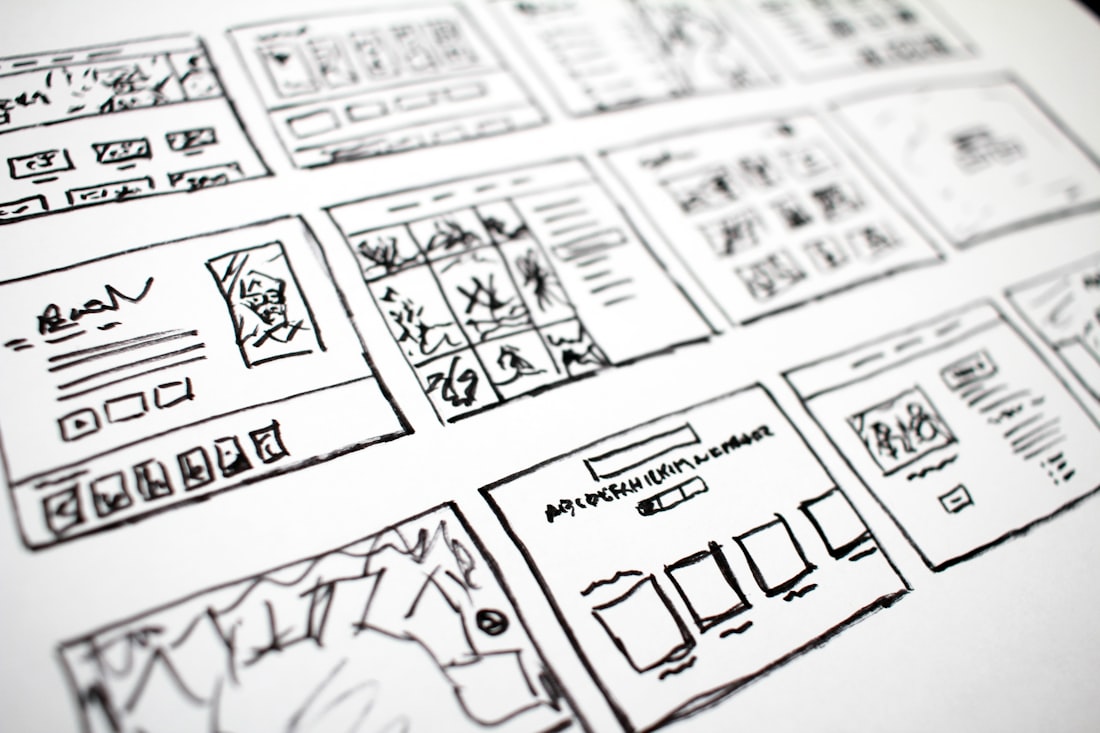
Greybox layouts — structure and hierarchy, deliberately rough so nobody fixates on style.

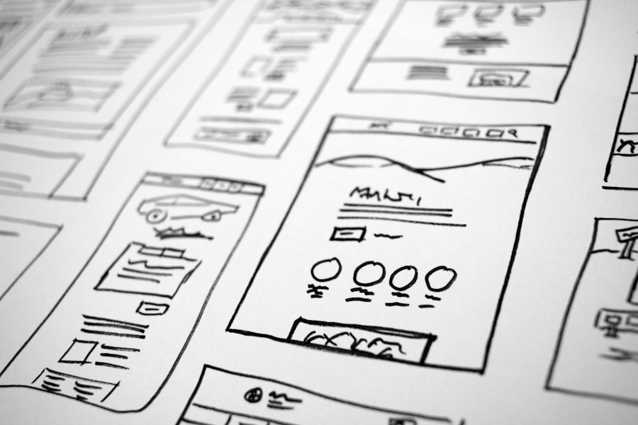
Mid-fidelity wireframes
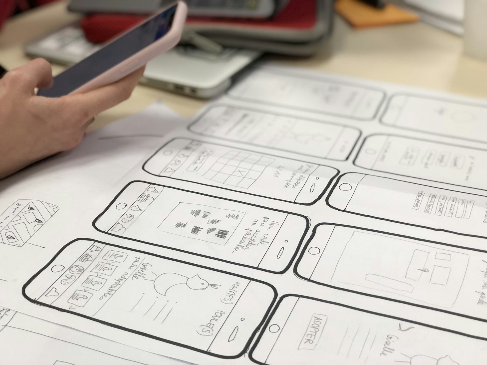
Tighter screens with real labels and spacing, for audiences who read rough as unfinished.
User-flow diagrams
How screens connect — the happy path, the edge paths, and the states in between.
Handoff annotations
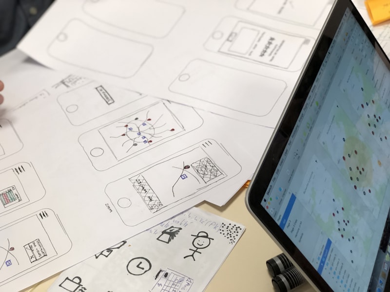
Behaviour, data, validation, and open questions written on the screens engineers build from.
From a rough sketch to something a developer can build.
- 1Sketch
- 2Flow
- 3Annotate
- 4Test
- 5Handoff
Each step earns the next: sketching gets a layout on the table, flow connects the screens and exposes the gaps, annotation pins down behaviour and states, a quick test surfaces where people stumble, and handoff hands engineering something it can actually build from.
Rough enough to keep changing.
We pitch the fidelity at the question, not the calendar. With engineers, low-fi greyboxes keep the talk on structure and flow instead of fonts; with an exec or a customer who reads 'rough' as 'not done', we step up to mid-fidelity so the screens earn a real reaction. Either way it stays deliberately unfinished, because a layout you can redraw in a minute is one people will actually push on.
- Low-fi greyboxes for structure
- Mid-fi when the audience needs credibility
- Fidelity tuned to who's looking
- Fast iterations over polish
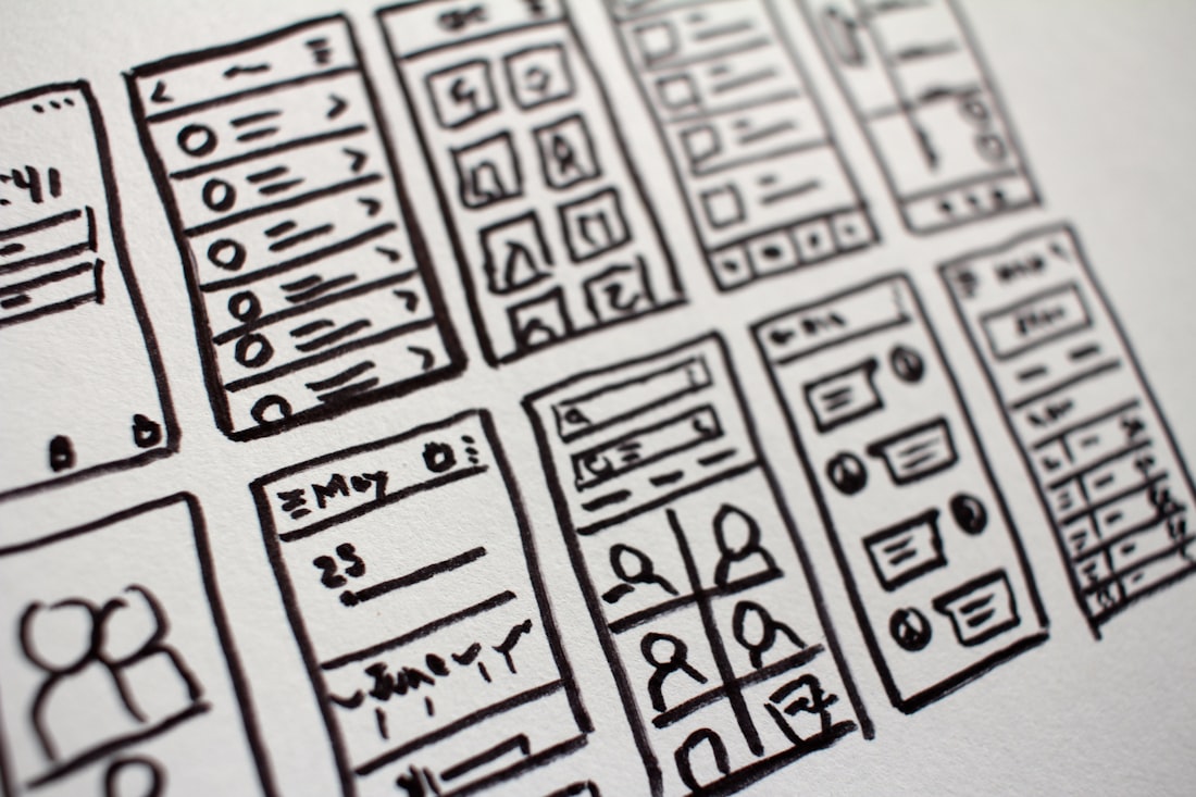
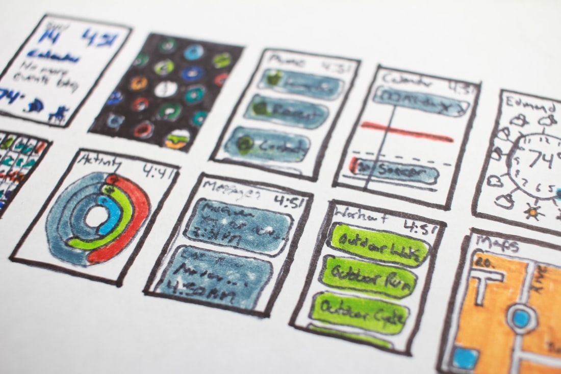
Map how the screens connect.
A single screen looks fine until you try to reach it. We diagram the flow — the happy path, the edge paths, and the states that hide between screens (empty, loading, error, success) — so the gaps show up while they're still cheap. Most of what derails a build isn't the obvious screen; it's the step nobody drew, and this is where we find it.
- The happy path, drawn end to end
- Edge paths and dead ends mapped
- Empty, loading, and error states
- Navigation that actually adds up
Annotated so engineering isn't guessing.
A wireframe that only shows layout leaves a developer filling in the rest by guessing — and guessing wrong. We annotate the screens with the behaviour: where data comes from, validation rules, what each state does, and the open questions that still need a decision. The result is something an engineer can build from on Monday without a queue of clarifying questions.
- Behaviour and interactions called out
- Data sources and validation noted
- Acceptance notes per screen
- Open questions flagged, not buried
Quick rounds, with your team in the loop.
Get the brief
We start from what the feature has to do, who it's for, and which audience the wireframes need to convince.
Sketch fast
Rough layouts on the screen quickly, so there's something concrete to react to within days, not weeks.
Connect the flow
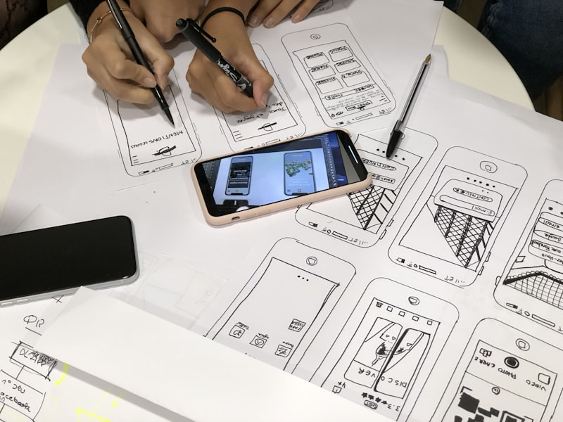
We wire the screens together and map the edge paths and states, exposing the gaps while they're cheap.
Review async
You and the team mark up the wireframes in place; we iterate in tight rounds instead of disappearing.
Annotate & hand off
Behaviour, data, and open questions written on the screens — something engineering can build from straight away.
The idea needs a shape before it needs a build.
The screen-that-doesn't-exist argument
Stakeholders keep debating a feature nobody's drawn — and every meeting circles the same disagreement.
You want to test before you build
There's an idea worth checking, and you'd rather find the holes in a sketch than in a shipped release.
Engineering is waiting on 'the design'
Good developers, blocked on a vague description — they need screens and the behaviour spelled out.
Tools chosen for speed, not polish.
The things teams ask first.

Draw it before you build it.
Tell us the feature you're arguing about and who needs to be convinced. We'll wireframe the screens and flows, annotate them for handoff, and give your team something concrete to test — before a single pixel gets designed.