
Dashboards people actually read.
Information design for dashboards — what to show, what to suppress, what to drill into — for the operators, leadership, and customers who'll live in them. Information hierarchy, component design, interaction patterns, and an engineering-ready handoff. The dashboard that ends a question instead of starting one.
A wall of charts isn't a dashboard — it's where answers go to hide.
Most dashboards fail the same way: someone put everything that could be measured on one screen, and now no one can find the thing that matters. A dashboard isn't a report you stare at — it's a tool for a decision. The hard part isn't plotting the data; it's deciding what to show, what to suppress, and what to drill into, so the person looking at it knows in seconds whether things are fine and what to do if they're not. We design that hierarchy first, then the components and the interactions around it. Less admiring the numbers; more acting on them.
More charts isn't more clarity.
Each symptom points at the same root — the design never decided what the screen is for.
- 01
Your dashboard is a wall of charts no one reads
A hierarchy where the number that matters is the first thing your eye lands on.
- 02
Operators want actionable, not informational
Surface the anomaly, make it clickable, put the next step right beside it.
- 03
Different roles need different views
Distinct views per role from one data model — not a compromise that serves none.
- 04
Every chart type is the wrong one
Chart choice driven by the question, not by what looks impressive in a demo.
- 05
It looks great until the data gets real
Empty, loading, error, and overflow states designed for a normal Tuesday.
A screen built around the decision.
Not a gallery of every metric you can compute — the few that drive an action, designed to be found.

Information hierarchy
What to show, what to suppress, what to drill into — the layout of the decision.
Component design
Charts, tables, cards, and KPIs chosen for the question, not for the demo.
Interaction patterns
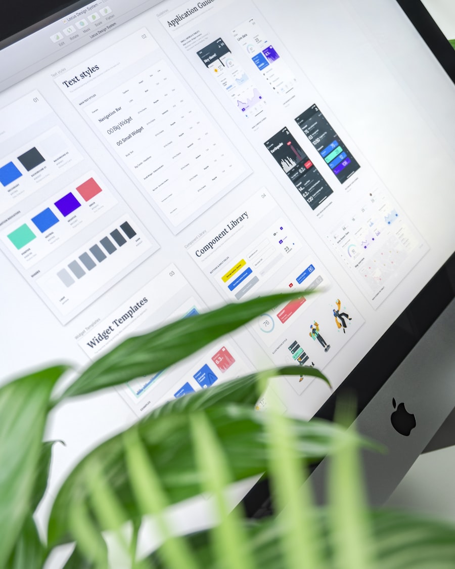
Filter, drill, export, and compare — designed so they need no tutorial.
Engineering handoff
Component specs, every state, and responsive behavior your team can build from.
From a wall of charts to a screen people read.
- 1Hierarchy
- 2Components
- 3Interaction
- 4Handoff
- 5Iterate
Each step earns the next: hierarchy decides what the screen is for, components give each metric the right form, interaction lets people filter and drill to the answer, handoff gets it built faithfully, and iteration tunes it against how the dashboard is actually used.
Decide what the screen is for.
Before a single chart, we figure out the decision the dashboard supports and who's making it. That tells us what to show up front, what to push into a drill-down, and what to leave off entirely. The number that matters gets the size and position your eye finds first; everything else earns its place or comes off the screen.
- What to show, what to suppress
- Glance vs. drill — what lives at each level
- A clear path for the eye, not a grid of equals
- Designed per role, around the decision


Components chosen for the question.
A chart is a means to an answer, not decoration. We pick the form that reads fastest for each metric — a line for a trend, a bar for a comparison, a big number for a status, a table when a table simply says more. We skip the impressive-but-illegible: the twelve-slice pie, the dual axis, the 3D anything. Color is used sparingly, so red means 'look here.'
- Charts for trends and comparisons
- Tables when they communicate more
- Cards and KPIs for status at a glance
- Color and size that signal, not decorate
Filter, drill, export, compare.
This is where dashboards stop being pictures and start being tools. We design clear patterns for filtering by time and segment, drilling from a summary into the underlying rows, comparing two periods or cohorts, and exporting what someone needs to take elsewhere. Sensible defaults make it useful before anyone touches a control.
- Filter by time, segment, and status
- Drill from a summary into the detail
- Compare periods and cohorts cleanly
- Export without leaving the flow

Decisions first, charts last.
Pin the decision
We start from the decision each view supports and who's making it — not the list of available metrics.
Set the hierarchy
What's glanceable, what's a drill-down, what comes off the screen — laid out before any chart is drawn.
Design the components
The right form for each metric, with states for empty, loading, error, and too much data.
Wire the interactions
Filter, drill, export, and compare designed so they're obvious without a tutorial.
Hand off and iterate
Specs and pairing with engineering, then tuning against real data and real usage.
The dashboard has the data and still doesn't answer the question.
Your dashboard is a wall of charts
Everything that could be measured ended up on one screen, and now no one can find what matters.
Operators want actionable, not informational
They don't want to admire a number that's down — they want to know what caused it and what to do next.
Different roles need different views
Leadership, operators, and customers are all squinting at the same compromise screen built for none of them.


Methods chosen for clarity, not decoration.
The things teams ask first.
Turn the wall of charts into an answer.
Show us the dashboard no one reads and who's supposed to be using it. We'll redesign the hierarchy, choose the components that actually communicate, wire the interactions, and hand your team specs they can build from — a screen people read in seconds, not study for minutes.