
A design system the engineers actually use.
Design tokens, a component library in Figma and code, a documentation site, and the governance to keep all of it current — built with engineering ownership from day one. The system that makes the consistent thing the default, and turns a brand update into a five-minute change.
A design system nobody adopts is just more documentation to ignore.
Most systems die the same quiet death: a designer ships a beautiful Figma library, engineering keeps shipping bespoke buttons, and within a quarter the two have nothing to do with each other. The problem was never the components — it was that using the system was harder than ignoring it. We build the other way around. Tokens go into the codebase engineers already use, components ship as real code with their Figma twins, and the docs make the right call the obvious one. The measure of a design system isn't how good it looks in a presentation — it's whether the next screen gets built from it without anyone being asked.
Pretty isn't the same as adopted.
Each symptom points to the same gap — between the system you have and the one your team actually builds with.
- 01
The product looks different on every screen
A shared library of tokens and components that makes the consistent thing the default.
- 02
Engineers keep re-inventing the same components
A canonical library that's faster to reach for than rebuilding from scratch.
- 03
Every brand update is a multi-week sweep
Tokens referenced everywhere, so a rebrand becomes editing values, not chasing styles.
- 04
Figma and the code have drifted apart
One source of truth, generated into both — parity a designer can hand off and trust.
- 05
The last design system rotted the day it shipped
A governance model and contribution process that keep it current after we leave.
A system, not just a sticker sheet.
Not a Figma file that drifts from the code — the tokens, components, docs, and rules a team builds on.

Design tokens
Colour, type, and spacing stored once and referenced everywhere — with theming built in.

Component library
The core components in Figma and code, with matching variants, props, and names.

Documentation site
Usage, do's and don'ts, and a changelog — a searchable home teams actually visit.

Governance & migration
An owner, a contribution process, and a plan to bring your old UI onto the system.
From the smallest decision to a system that sticks.
- 1Tokens
- 2Components
- 3Docs
- 4Governance
- 5Adoption
Each step earns the next: tokens set the vocabulary, components turn it into reusable parts, docs make them findable, governance keeps them current, and adoption is the only proof that any of it worked.
The decisions, stored once.
We start at the layer underneath the UI: tokens for colour, type, spacing, radii, and themes — named decisions stored once and referenced everywhere instead of hard-coded in a hundred places. Wired into the codebase your engineers already use, tokens are what make consistency automatic and a rebrand a controlled change rather than a hunt.
- Colour, type, and spacing as named tokens
- Theming and dark mode built in
- Generated into both Figma and code
- Wired into the stack engineers already use


Components that match in both worlds.
We build the core component library twice over — as real, typed code and as a Figma library — and keep them describing the same thing. Matching names, variants, and props mean a designer's handoff is buildable without translation, and accessibility ships inside each component rather than getting bolted on screen by screen.
- The same components in Figma and code
- Variants, states, and props that line up
- Accessibility built into each component
- Versioned, so updates are safe to adopt
A home teams actually visit.
A component nobody can find gets rebuilt. We ship a documentation site with usage guidance, do's and don'ts, live examples, and a changelog — so the right component is one search away and obviously the right call. Good docs are what turn a library from a thing that exists into a thing the team reaches for first.
- Usage guidance and live examples
- Do's and don'ts per component
- A changelog tracking every release
- A searchable site, not a buried Figma page


With engineering, from day one.
Audit the UI
We map what's actually shipping — the components, the colours, the spacing — and where it's drifting apart.
Set the tokens
Colour, type, and spacing become named tokens, wired into the codebase engineers already use.
Build the library
Core components in Figma and code, with matching variants, accessibility, and versioning.
Document & govern
A docs site, a contribution process, and an owner — so the system stays current after launch.
Migrate & adopt
A sequenced plan brings the old UI onto the system while the product keeps shipping.
When the UI has outgrown doing it by hand.
The product looks inconsistent
Every screen reads slightly differently because each was built from scratch with its own spacing and colours.
Engineers reinvent components
There's a fourth bespoke button this quarter, because finding and reusing one is harder than writing a new one.
Brand updates are painful
A colour change means a multi-week sweep through hard-coded styles, and everyone dreads the next rebrand.

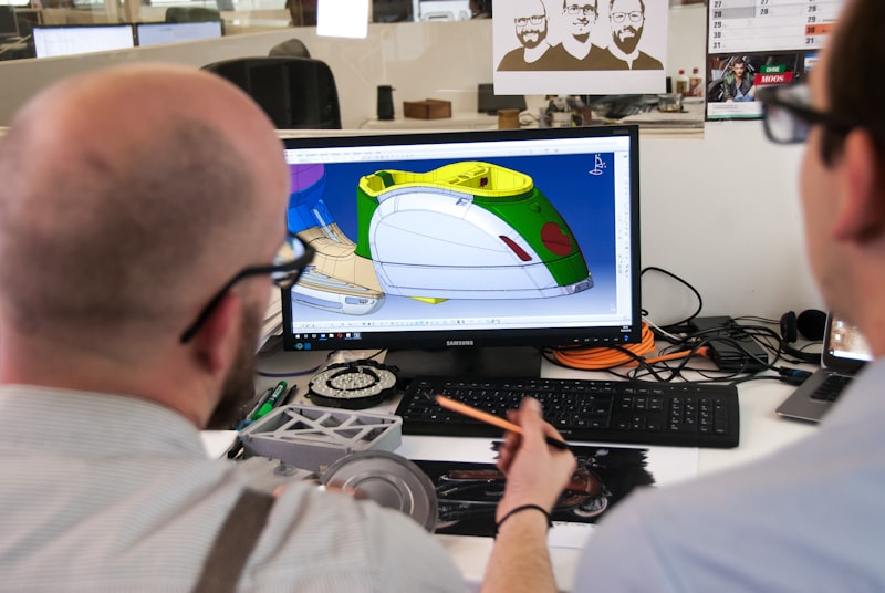
The layers that make a system hold.
The things teams ask first.

A system the team actually uses.
Tell us where the product looks inconsistent and what your front-end stack is. We'll set the tokens, build the component library in Figma and code, ship the docs and governance, and plan the migration off your old UI — a design system your engineers reach for first.