
The leadership view that's actually trusted.
Dashboards for revenue, retention, ops, and product — tied directly to your source-of-truth systems, with one written definition per metric, so leadership stops second-guessing the numbers and starts deciding from them.
Metric definitions / warehouse pipelines / drill-down / alerting
A dashboard nobody trusts is just decoration.
Most business dashboards fail quietly: leadership glances, doubts a figure, and goes back to asking an analyst for "the real number." The problem is almost never the chart — it's that two teams define the same metric two ways, the data is a stale copy, and nobody can trace a figure to its source. We fix the foundation, not the front-end: one definition per metric, piped from the source of truth, drillable to the row. Then the dashboard becomes what it should be — the thing the room actually decides from.
Trust is earned in the data, not the design.
Each familiar symptom has the same root — and a concrete fix we build in.
- 01
Two teams, two answers for "what's our MRR?"
One owned definition per metric, in a registry.
- 02
Leadership doesn't trust the dashboard
Every figure drills down and ties to its source.
- 03
Reporting is a manual spreadsheet drag
Automated pipelines; the number's always live.
- 04
A metric quietly changed meaning
Definitions in version control, changes logged.
- 05
Nobody noticed churn moved for a week
Alerting on the thresholds that matter.
The vital few — defined, not decorated.
We resist the eighty-chart dashboard nobody reads, and make the numbers that matter unmissable.

Revenue
MRR, ARR, expansion, contraction, and churn — one agreed way, finally.

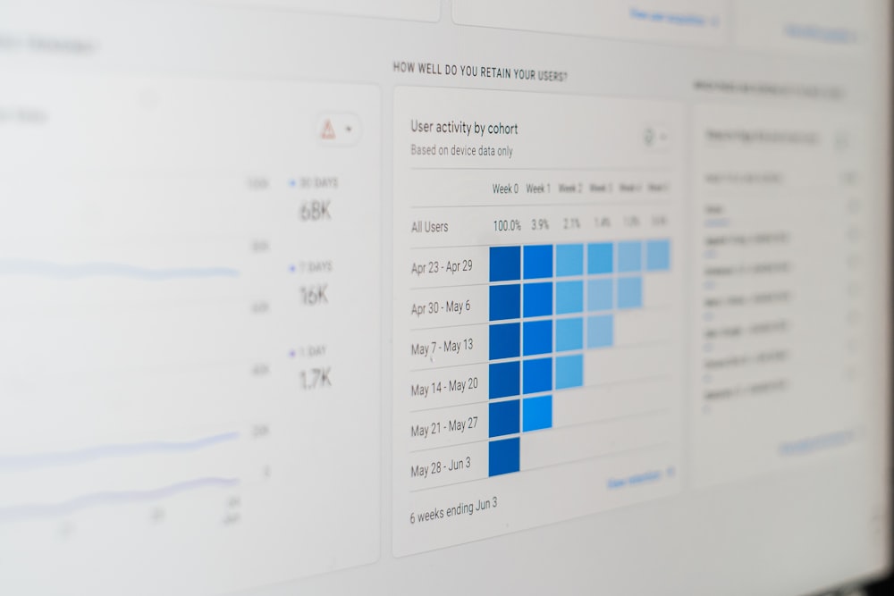
Retention & cohorts
Who stays, who leaves, and how each cohort behaves over time.

Operations
The throughput, SLA, and efficiency metrics your model runs on.

Product
Activation, engagement, and the few signals that predict growth.

Finance & board
The board-ready view that ties out to the books, every time.

Custom KPIs
The handful of numbers your leadership actually steers by.
One definition. Owned. Written down.
The heart of a trusted dashboard isn't a chart — it's a registry where every metric has a single, owned definition: what counts, what's excluded, the source, and the window. Compute from that, and a number means the same thing in every room.
- One owned definition per metric
- What's in, what's out, made explicit
- Versioned alongside the pipelines
- The shared language the business agrees on


Piped from the truth, not a stale copy.
Numbers go wrong the moment they're copied into a spreadsheet and left to drift. We pipe data straight from each source system — Stripe, your product DB, the CRM — into a warehouse, model and test it there, and build the dashboard on top.
- Pipelines into BigQuery or Snowflake
- Modelled, tested, documented data
- Always derived from the source
- No more reconciling four spreadsheets
Click any number. See where it came from.
Trust comes from being able to verify. Every figure expands into the segments, cohorts, and individual rows beneath it — so the dashboard answers the second question, 'why did it move?', instead of just raising it.
- Top-line to segment to row
- Cohorts, filters, and time ranges
- Ties out to the source system
- Self-served answers, fewer analyst pings

Hear about it in hours, not at month-end.
A dashboard you have to remember to check is a dashboard that catches problems late. We set alerts on the thresholds that matter — a revenue dip, a churn spike, a metric that simply stopped updating — delivered with enough context to act.
- Thresholds on the metrics that matter
- "Stopped updating" caught early
- Routed to Slack or email with context
- Problems reach you while they're small
The screen everyone looks at — and believes.
The mark of a great business dashboard is a quiet one: a meeting that argues about the decision, not about whose number is right.

Definitions first. The chart comes last.

Agree the definitions
We get the teams in a room and pin down what each metric means — the unglamorous, decisive step.

Map the sources
We trace every metric to its system of record and design the pipeline into the warehouse.

Model & test
Data is modelled and tested in the warehouse, so the numbers are correct before they're ever shown.

Build the dashboard
A focused UI with drill-down and alerting — on your BI tool or custom, whichever fits.

Review quarterly
We set a cadence so definitions and dashboards keep matching how the business actually thinks.
The numbers are slowing decisions down.
Two teams have two answers for one metric
Until there's an owned definition, every meeting starts by arguing about whose number is right.
Leadership doesn't trust the dashboard
They've been burned before. We rebuild trust with traceability, not a redesign.
Reporting is a manual spreadsheet drag
The monthly assembly is cost and risk. Automate it and hand the time back.


Modern data tools — with the definitions to match.
The things leadership asks us first.

Make the number trusted.
Tell us which metric your teams argue about, and where the numbers come from today. We'll pin down the definitions, pipe them from the source of truth, and build the dashboard your leadership finally decides from.
ReimeiTech builds internal business dashboards — a metric definitions registry, pipelines into a warehouse (BigQuery, Snowflake), a dashboard UI with drill-down, alerting on threshold breaches, and a quarterly review cadence — so leadership stops second-guessing the numbers and starts trusting them.