
The numbers, explained — with the receipts.
We build reporting that reads your warehouse and dashboards and writes the story behind the figures — what changed, why, and what to do about it — alongside the numbers themselves. Every claim cites the rows it came from, so it's a summary you can check, not a paragraph you have to trust.
A chart tells you what happened — not why, or what to do about it.
So leadership asks the same questions every week, and someone spends Monday morning pulling the same figures and writing the same recap. The numbers are right there; what's missing is the reading. We build reporting that does that reading — a language model that queries the warehouse, explains the movement in plain English, and cites every claim back to the rows underneath. Not a freestyle paragraph that might be wrong, but a grounded narrative you can click into and verify. The chart still shows what happened. Now something explains it, with the receipts attached.
You have the data. Nobody has time to read it.
Each symptom has the same root — and the same fix grounded in your warehouse.
- 01
Leadership asks the same questions every single week
A standing narrative that answers them before the meeting starts.
- 02
The dashboard has numbers but no explanation
Plain-language context alongside each figure — what moved and why.
- 03
Someone hand-writes the weekly recap from scratch
A first draft generated from the warehouse, ready to review.
- 04
A surprising change isn't noticed until it's a problem
Anomalies surfaced in the narrative, not buried in a chart.
- 05
Nobody quite trusts a summary they can't check
Every claim cited to the exact rows it was computed from.
The story behind a number you can check.
From warehouse rows to a written read — the explanation that turns a chart into a decision.

Data source integrations
Reads straight from the warehouse and dashboards your numbers already live in.

Narrative templates
Reusable structures for the weekly, the monthly, and the board update.

Grounded generation
Claims drawn from real query results, never freestyled from memory.

Citations to the rows
Every figure links back to the exact source it was computed from.

Anomaly highlighting
Unusual movement surfaced in the prose, not left for someone to spot.

Approval & personalization
A review step before delivery, and a tailored version per recipient.
Every sentence, traceable to its rows.
- Data01
- Detect change02
- Explain03
- Cite sources04
- Approve05
- Deliver06
The system reads the data, notices what moved, explains it, attaches the source for each claim, waits for a human to approve, and then sends. Every step is grounded in the one before it — so the narrative on the right always traces back to the rows on the left.
It reports the data, not its imagination.
Before a sentence is written, the system runs real queries against your modelled tables. The narrative is assembled from those results, so it describes what's actually in the warehouse rather than what the model half-remembers. If the data doesn't support a claim, the claim doesn't get made.
- Narratives built from live query results
- No statements the rows don't back up
- Metric definitions written down and reused
- Missing or late data called out, not papered over

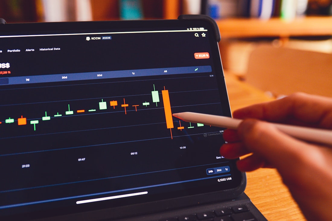
The reading, written for you.
Instead of a wall of figures, you get a short, plain-language account of what moved, what likely drove it, and what's worth doing next — the read leadership asks for every week, generated from the same numbers they're looking at. Reusable templates keep the weekly, monthly, and board versions consistent.
- What changed, why, and the suggested next step
- Reusable templates per report cadence
- Plain English, alongside the numbers
- The first draft, ready for a human to refine
The surprising thing, brought to you.
The system watches your metrics for movement outside their usual range and surfaces it in the narrative — a sudden drop, a spike, a segment behaving differently. You don't have to know the right question in advance; the unusual change is raised, with the underlying numbers, so the weekly read stops being a hunt.
- Movements outside the normal range flagged
- Raised in the prose, not buried in a chart
- Each flag backed by the rows behind it
- Caught early, before it becomes a problem


Reviewed first, tailored per reader.
Nothing goes out unread. A narrative is generated, a person approves it, and only then does it reach leadership or clients — and you decide how tight that gate stays. The same data can produce a three-line summary for the CEO and a channel breakdown for the marketing lead, each from the same trusted source.
- A human approval step before delivery
- Per-recipient versions from one source
- Delivered to email, Slack, or the dashboard
- Gate every send, spot-check, or automate the routine
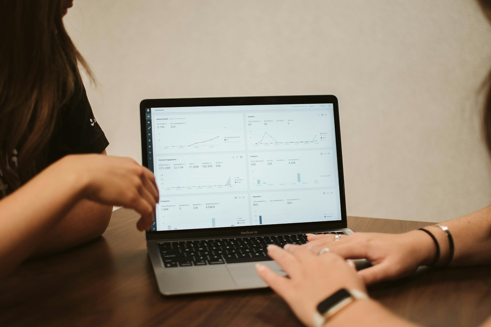
Built to be trusted — and checkable.
Find the questions
We learn which questions leadership asks every week and which numbers the answers depend on.
Pin the definitions
We write down what each metric means and which warehouse tables it's drawn from, so the read is consistent.
Build the grounding
We wire the model to query those tables and assemble narratives from real results, with citations attached.
Add anomalies & approval
Unusual movement gets surfaced in the prose, and a human approval step is built into delivery.
Personalize & hand over
Per-recipient versions, delivery to your channels, and a system your team can adjust on their own.
You want context, not just more charts.
The weekly recap is written by hand
Someone spends Monday pulling the same numbers and re-typing the same summary, every single week.
Charts get sent without context
Numbers without a read just move the work downstream — now everyone has to interpret them alone.
A summary nobody can verify
An explanation people can't trace back to the data gets second-guessed, and the whole point is lost.


Capable models, kept on a short leash.
The things people ask before they trust it.

Stop sending numbers without the story.
Tell us which questions leadership asks every week and where the answers live in your warehouse. We'll build reporting that writes the read for you — grounded in the rows, cited to the source, and sent only once a human has signed off.